Tremolo

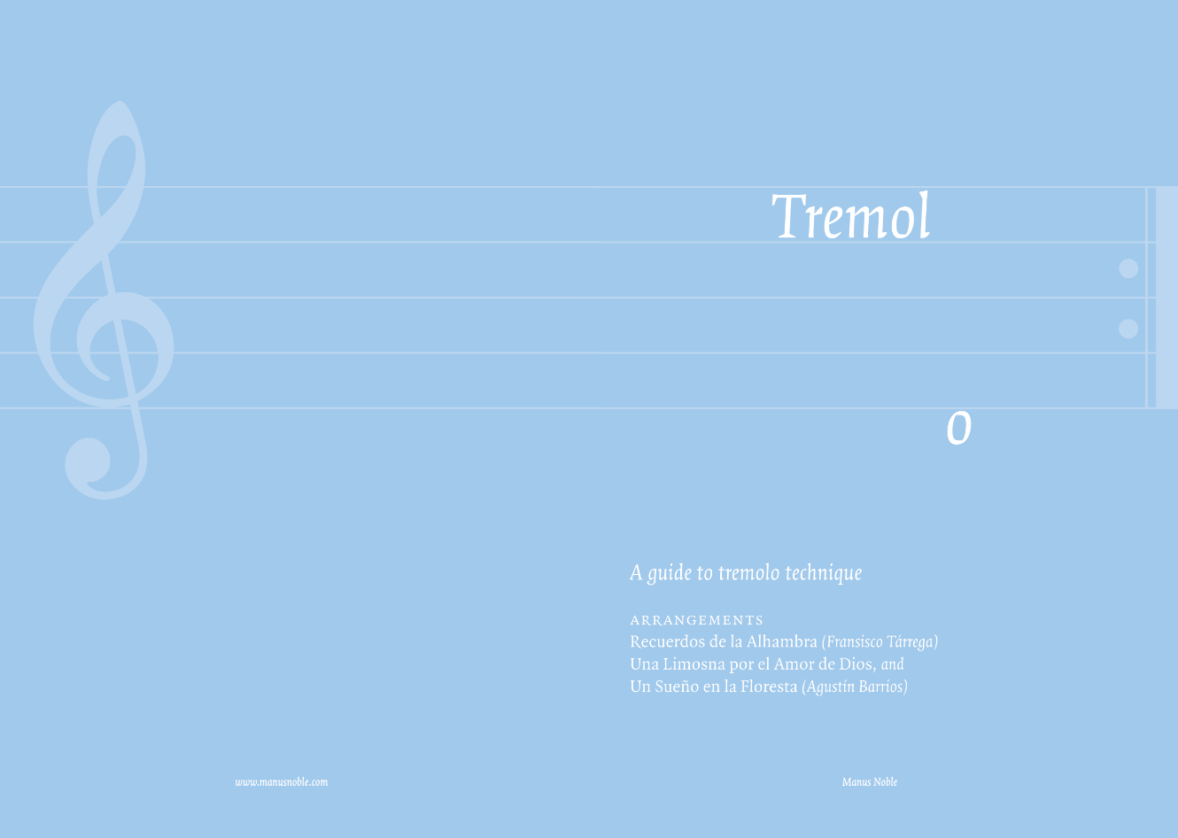
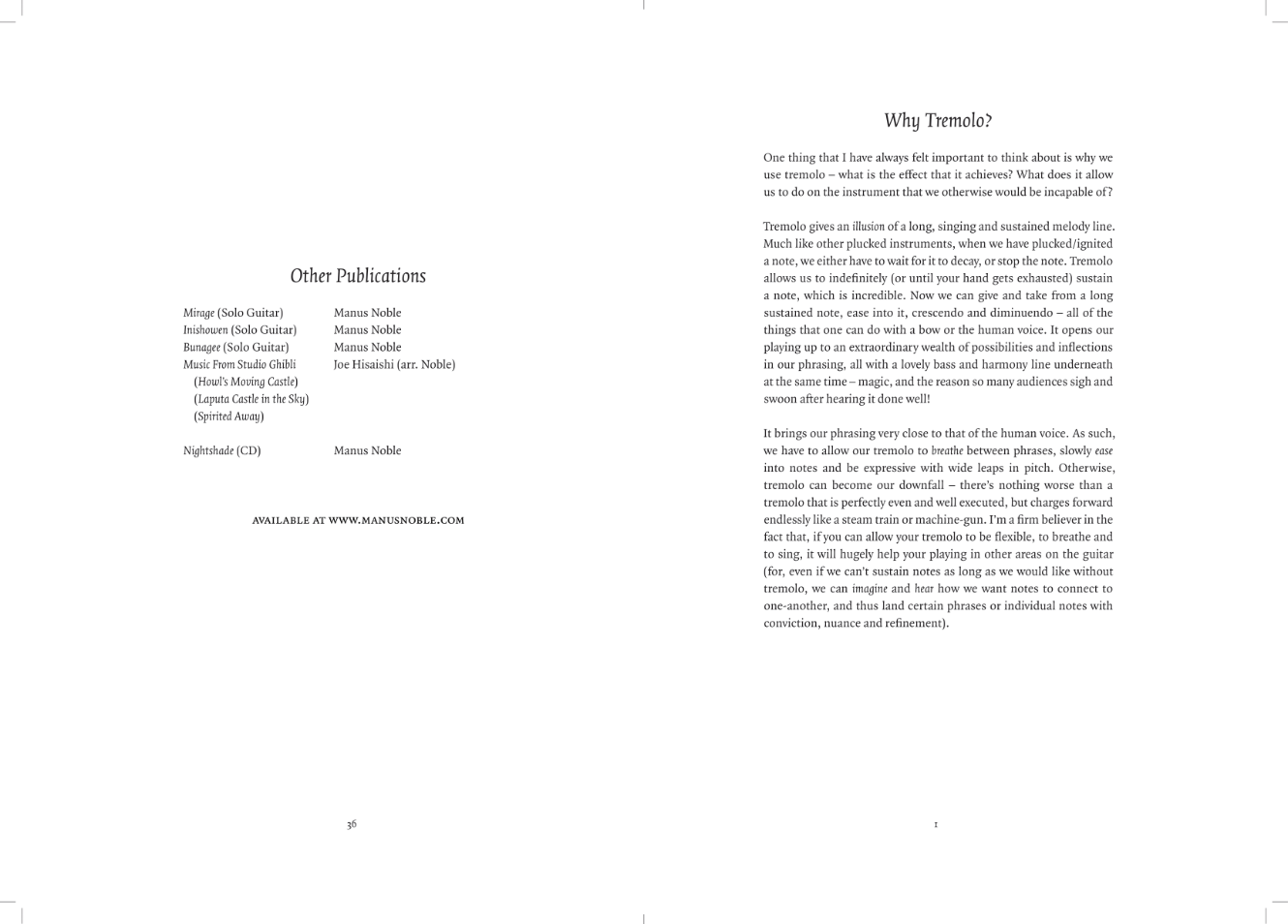
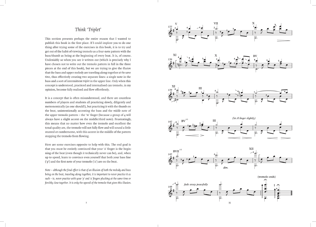
I designed the inside and outside of my brother’s guide to classical guitar tremolo technique. This was a lot of fun and got me back into text layout to boot, for which I relied heavily on the indispensible Book Typography: A designer’s manual. Getting everything laid out for printing in InDesign was markedly less fun, however.

The typeface is Quadraat, one of my personal favourites and gorgeous at display and text sizes – quite a rarity!

There’s no recording of him demonstrating the technique unfortunately, but this is his shop where you can purchase this guide as well as all of his scores.